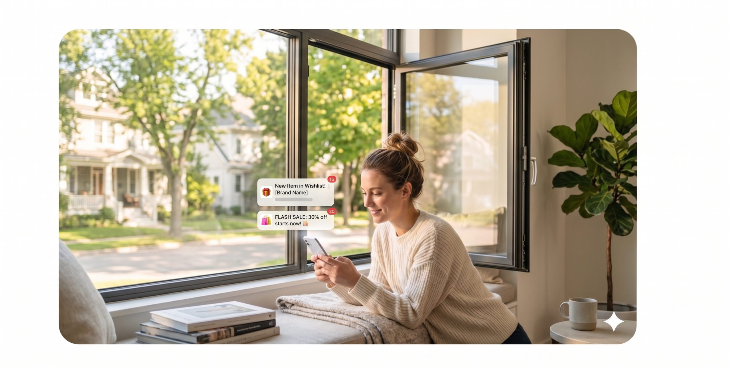

First impression may not be the last impression in the world of emails, but it always matters—mainly because user behavior indicates that the maximum chance of emails being opened is only once. So what is it that ensures maximum open rates?
design begins in the inbox
Designing the perfect email isn’t just about finding the right images and colors for the message you want to deliver to your subscribers. The process includes everything from choosing a familiar “from” name to crafting the perfect subject line and ensuring your email does not look like a spam mail.
Crafting the Perfect EmailVisually appealing email designs and flawless code are the basis to creating the perfect email experience. Even though email design is one of the most underrated aspects of the email marketing process, the impact email design can have on the success of a campaign is immense. So what are the things you need to take into consideration?
1. Brand Optimization
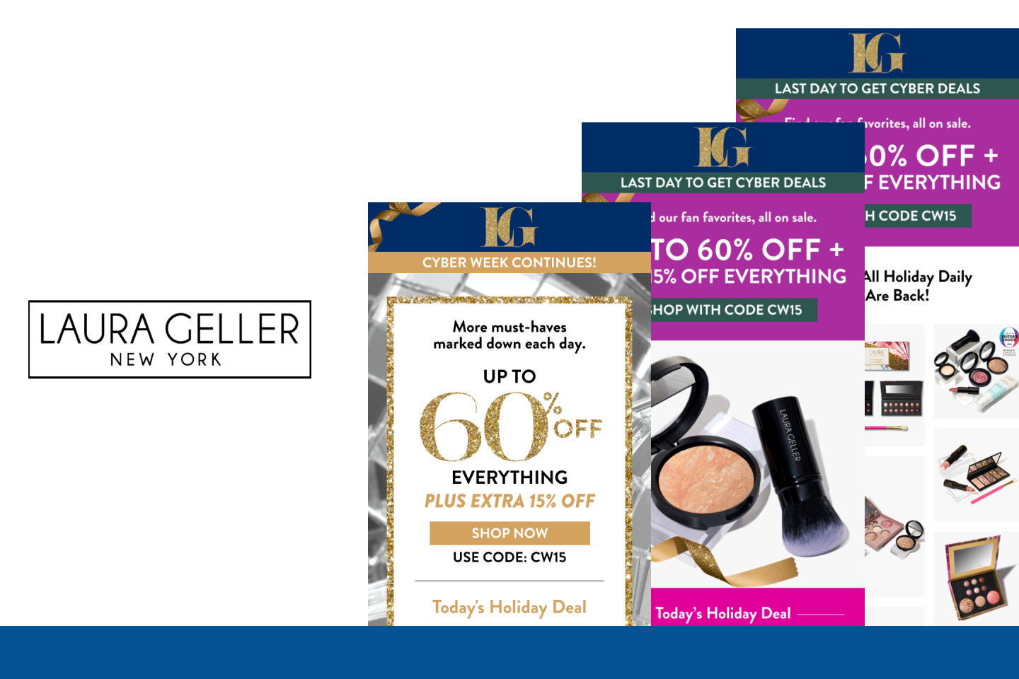
Brand optimization is by far one of the most crucial email design best practices. From including your brand name in the “from” field and using an identifiable address to ensuring that the “to” field carries the recipient’s name and not their email address, every part of your email should be on-brand. This is indispensable for ensuring email success and sustainable brand reputation.
There’s no shortage of theories as to what to write and what not to write in subject lines, but what actually matters is the domain reputation. If you have a high domain reputation score, all those factors are obsolete; but if you have a low score, you need to take care that you stay away from using phishing phrases in the subject line that attract spam filters.
2. Pre-header and Header
Email marketers often fail to recognize the importance of headers and pre-headers in an email. Along with adding a link to an online version of your email, snippet text is one of the most popular trends at the moment, as many email clients like Gmail, Outlook, and the iOS mail app allow you to show snippet or preview text (usually limited to 100 characters or less).Pre-header in emailsThere’s also the “peek and pop” feature in iOS 9 and iPhone 6S, which allows email subscribers to peek at the content of the email from the pre-header section itself without even opening it. This features comes with its own limitations: Even though consumers are not really opening the emails, they will be counted as opened emails.
3. Email Layout
Marketers don’t always place much importance on email layout: how it should look, its size, the text to be used, the fonts, the colors, etc. Studies indicate that an ideal email width is 500 to 650 pixels, and a vertical layout is preferred over a horizontal one. A table of contents should be used if you have a lot to cover in a restricted space. If you have multiple products or categories to display, a navigation bar can be key. Limit yourself to four or five sections for better visual emphasis, and include clear and appealing calls to action.
4. Visual Impact
“A picture’s worth a thousand words” is especially relevant to the media world. When it comes to email marketing, graphics and imagery should define content sections clearly.
If you are using an image, it’s important to provide fallback color and alt-text for the image. Avoid background images layered behind text, as many of the email clients (such as Outlook) do not support background images. Avoid squishing or stretching of images in emails to ensure they’re sized appropriately. If you’re creating images for fluid emails, make sure they can scale up to 599 px. Make feature headers or product offers easily clickable in the email template. It’s all about making your email alluring—there is no second chance to make a great first impression.
5. Copy and Content
Content is an integral part of email design—it is the context and the copy that drives business from the email campaign. Besides using short sentences and paragraphs, make sure you use design elements like spacing and dividing lines to separate content sections. Add line breaks every 60 characters in your plain text emails to increase legibility.Also make use of bullets to make your content more visible while using web-safe standard fonts like Arial, Arial Black, Arial Narrow, Comic Sans, Courier New, Georgia, Impact, Tahoma, Times New Roman, and Verdana. Play it safe with a body copy font size of 14 pixels and 22 pixels for title.
6. Footer
Even though the footer comes at last, it’s not the least—in fact, it’s one of the most significant parts of an email. An ideal email footer should not only include the organization’s contact details, but also links to main segments of your website, key services or products, and social sharing or “forward to a friend” buttons. Another significant addition to the footer that most marketers miss is a, “Why are you receiving this email?” line that will diminish chances of your emails going to spam folders.
Footer in EmailsThe introduction of block functionality by email clients like Gmail empowers subscribers to “block” a sender, which will ensure they’ll never receive an email from that sender again. Too many blocks can be detrimental to your sender reputation. Make sure you do not hide the unsubscribe button.
7. Social Media Integration
Using social icons is one of the easiest ways to integrate your social media marketing with your email campaigns. Even though it seems obvious, make it a best practice to insert social icons into all your email campaigns, including:
Sharing icons within the email.
Social icons on your unsubscribe page.
Social icons on your “thanks for signing up” page.
Sharing icons inside recurring email newsletters.
Social icons in auto-responders and official mail signatures.
Optimization Best Practices
1. Bulletproof Buttons
Image blocking is one of the biggest challenges for email marketers. One of the proven solutions is to use bulletproof backgrounds and buttons, which will help display background images in Outlook as well. Make sure to check if your ESP supports VML (Vector Markup Language) coding, an XML-based file format for two-dimensional vector graphics.
You can also use alt tags to create beautiful pixel art in emails as a clever way to reach out to your subscribers who have default settings to block images in their emails. However, while using pixel art, ensure that you scale the images accordingly for smaller devices.AltTag in Emails
2. Retina Emails
Blurred logos, images, and icons in your emails are passé. Welcome to retina emails! All you need to do is double the normal dimensions of email images to around 1,100 pixels. This will not only reduce file size by 20 percent with no downsides, but also save them five percent on quality.retina emailsWith the advent of the mobile revolution, more and more users are using Apple devices to access their emails. Retina images in emails can be an important strategic decision for your company.
3. Wearables
The global wearable market is expanding at a compound annual rate of 35 percent and is expected to hit 148 million units shipped in 2019. This makes optimization of marketing emails for wearable technology viewing environments all the more important and a strategic decision for businesses nowadays.Email for wearablesWhat needs to be taken into consideration when designing emails for wearables such as Apple Watch, Gear, etc.?Minimalist designIn the absence of a browser on wearable watches, links in the plain text version are specified with grayed out text.Embedded images or remote images stored on your server will not render well; relying on plain text is the key.
4. Peek and Pop
The revolutionary “peek and pop” feature that comes with iOS 9 and iPhone 6S has changed email marketing to a great extent. While the feature allows the subscriber to peek into your email without actually opening it, the challenge for marketers is that it gets acknowledged as “email opened,” possibly setting open rates stats in a tizzy. The pitfalls of this feature lie in the possibility of pseudo-signals, causing discrepancies in open rate values and reduced engagement.
Think Mobile, Go Responsive
The world of email marketing has begun to brace itself for the growth of the smartphone industry, set to reach 2.65 million users by 2019. A sizeable 50 percent of users open their email on smartphones, and the number increases to 67 percent when taking into account mobile devices in general, making it all the more important to design emails that are responsive for greater reach.
Smartphone users StatsSo what parameters do you need to consider while going mobile?Determine the number of third-party app users. For instance, if the native app on your iPad is Mail, you might also have other third-party apps for iOS to support it like Gmail, Yahoo!, and Mailbox, etc.If the majority of your subscribers are third-party app users, try using a single column layout instead of two or more columns, as a one-column format is more readable, while the latter crowds the screen space
.Follow email design best practices that suggest emails should be designed for 320 and 480 pixel view.
Make your CTA button a minimum size of 44×44 pixels with plenty of white space around it. Make sure you spread the button across the width of the email if possible, and set it apart from the rest of the email content so it’s conveniently tappable.
Credit: Kevin George for Convince And Convert