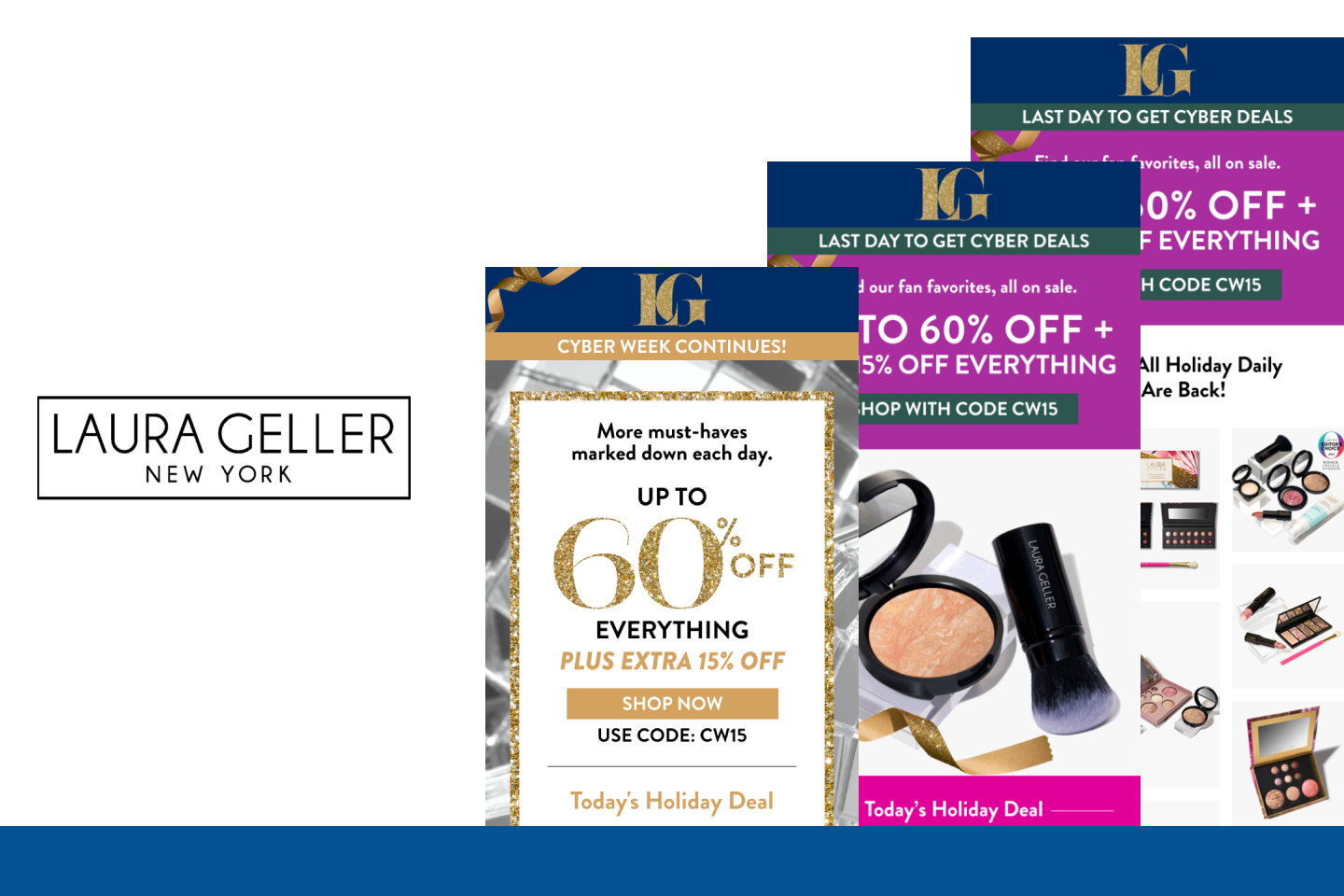
The people who receive your emails are most likely to examine its contents through a preview pane at the bottom of their inbox. So what should people see when you look at your email in their preview pane? And how can you make sure that your content gets the message across – however people choose to view it?
The most common setting for viewing emails is with a preview pane at the bottom of the inbox. To find out exactly which email clients your subscribers are reading your messages in, use the Fingerprint application.
As a basic rule of thumb, however, what works in almost all situations is to make sure that your content is accessible within the top of your message. Even if users are not using a preview pane the top will still be the first – indeed, often the only – part of your message they will see.
What should people see of your email in their preview pane?
At the very least your preview pane should include:
navigation bar
links to email contents
branding
Navigation Bar: The navigation bar will be similar to that on your website but optimized for your emails. Your website nav bar is a good place to start – but to optimise this prime part of your message real estate, make sure you keep an eye on your clicks and test different links and wording. As discussed in this month’s Talking Email, these functional links will most likely generate a higher proportion of revenue than other links in your messages.
Links to email contents: the most effective way to include as much content as possible within your preview pane is to provide hyperlinks that showcase and give easy access to segments further down in your message.
Branding: one of the most overlooked and undervalued advantages of regularly contacting your subscribers via email is the opportunity to reinforce your brand. Make sure your preview pane includes branding, both with images on and off, and that the overall look and feel of your message reflects your brand image. Poorly branded emails can adversely affect your reputation, both online and offline.
Images: many, many messages get sent out with large images at the top of the email. But with images turned off – as many recipients do – a big blank box with a red cross in the corner will be all your subscribers will see. Alt tags can help with this but even these will not be visible in some email clients. (Do make sure you get a copywriter to write your alt tags, however, so that they are useful and meaningful rather than simply “image 1” or “boy with dog”.)
Always be sure to optimise the content of your preview pane for subscribers viewing your message with images disabled. Include text behind images, or use collapsible images. These solutions may cause other rendering problems, so make sure you test your rendering in all possible browser, application and client combinations.
Test, test and test again
You know your objectives, products and subscribers best. We’ve seen emails that completely go against all best practice get good results, although this is generally the exception rather than the rule. The only way to know for sure what works for you is to test.
Last updated: Nov 05, 2014 admin


