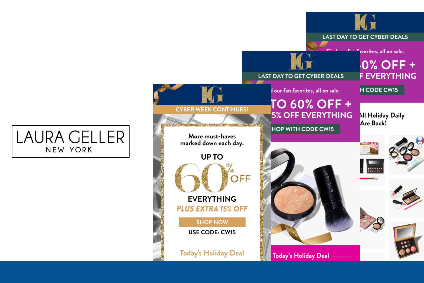
When it comes to emails, there have been epic clashes between branding managers and user experience experts over things as simple as colors and shapes. If your bottom line depends on who’s right, settle the argument with an A/B test. A/B testing your creative is essential to the short- and long-term performance of your campaigns.
Yes, your brand manager, marketing manager, creative director, and UX director should all have a say in how your emails look and feel, but very often your readers will have the final say by voting with their clicks. So, what should you be testing? Everything.
But for the sake of time and budgets, you may want to look at these five critical elements, particularly if you’re ready to make some updates to your current approach, or if it’s been a while since you’ve done any real testing.
Personalization
As personalization gets more sophisticated, it is also becoming more effective. Whether you’re simply using your customer’s name, or if you’re taking it a few steps further and using a fully integrated personalization system that recommends products to individual customers, you’ll want to test to see how customers react. Some find personalization intrusive, while others appreciate the individualized attention.
Layout
Is it time to update your email template? Readers and shoppers are savvy and they don’t want to look at a stale template. Heatmaps are one way to see where readers are typically looking on your page. Keep important info on top, people purchase what stands out and they tend to look left on an email. Also, people tend to scan images in a “Z” pattern on the page, but they read copy in an “F” pattern, so create a good flow between copy and images to increase engagement. Test big issues first, then start refining.
Copy length
Copy length may have a huge impact on open and click-through rates. The amount of copy that’s appropriate will depend on your product and your audience – but conventional wisdom says to keep in short. When writing email copy – look for chunkability (short sentences), relevance, accuracy, brevity, and scannability (a reader should be able to quickly scan your email and still get its meaning).
Images
As noted above, products that are highlighted will sell better. Deliver the best images possible without compromising email load time and test, test, test to find out what your audience wants to see. Get specific with your image testing and work with your team on elements to test. You might test colors, image sizes, the idea of showing models wearing your product, or just showing the product – the elements of testing images will be closely related to your brand and your goals, but put some time into knowing what type of images deliver the best results.
Call-to-action
Where to place your call-to-action (CTA), how big to make it, what color it should be, how many times to insert it into the email, when there should be primary and secondary CTAs. All of these are issues you’ll want to test. There is a lot of research on how and when to ask for that click-through. Even a nuance like a single word can alter response a great deal.
Offer
Of course, testing your offer is the most important element of all. You want to find out what type of offers your audience – or audience segments – like best. What motivates them to click through and buy, and what makes them ignore your email entirely? Testing your offer in subject lines and email body will help, as well.
Never let your creative testing get stale. While you want your brand to maintain a consistent look and feel throughout the customer experience, you also want the customer to feel like every time they see an email from you, they’ll get something fresh. Testing will help you understand how to keep the love affair between your customers and your brand forever young.


